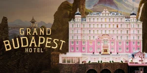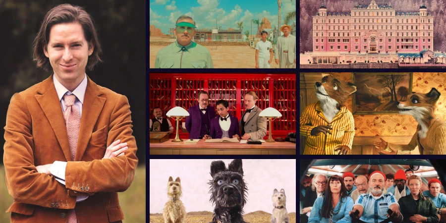

Watch the opening of The Grand Budapest Hotel for sixty seconds. Every shot is perfectly centered. Every prop is placed like someone measured twice. A lobby boy stands in frame like a figure in a diorama, and the whole thing looks like a painting that somehow learned to move. That is Wes Anderson’s style in a nutshell, and it is one of the most immediately recognizable signatures in American cinema right now. People debate whether Anderson is a genius or a gimmick. What nobody debates is whether you can spot his work in the first five seconds of any given shot. You can, every single time.
What Actually Makes Wes Anderson’s Style So Recognizable
Most directors have preferences. Anderson has a system. His compositions follow rules so consistent they feel almost mathematical, and once you see them, you cannot unsee them.
His most defining tool is center-frame symmetry. Characters stand dead center. Doors, hallways, and staircases split the frame exactly in half. In Moonrise Kingdom (2012), nearly every outdoor shot places the horizon line at the same height and the characters at the same lateral position, like paper cutouts arranged on a stage.
He also uses a flat, perpendicular camera angle, sometimes called the “planimetric” shot, where the camera sits directly in front of the scene with no tilt, no dutch angle, no attempt at drama through lens geometry. It creates a detached, almost clinical look that somehow ends up feeling warm.
His Core Toolkit, Broken Down
- Centered framing: subjects placed on the exact vertical midline of the frame, almost without exception
- Flat camera placement: the camera rarely tilts or adopts oblique angles; it watches scenes head-on like a theater audience
- Pastel and earth-tone color palettes: each film gets its own dominant hue, often muted pinks, ochres, or dusty greens
- Lateral tracking shots: the camera moves left or right in smooth, mechanical dollies rather than pushing in or pulling out
- Whip pans: fast cuts between symmetrical compositions that give his films a storybook rhythm
- Hand-crafted set design: miniatures, practical models, and built environments instead of heavy digital replacement
None of these are new inventions. Stanley Kubrick used centered framing in The Shining and Full Metal Jacket. Jacques Tati used flat camera placement in Playtime to brilliant comic effect. What Anderson did was commit to all of them at once, in every film, across every genre he touches.
The Color Palette Is Doing More Work Than People Realize
Anderson’s color choices are not just an aesthetic preference. They do actual storytelling work.
In The Grand Budapest Hotel (2014), cinematographer Robert Yeoman and production designer Adam Stockhausen built a color logic across different time periods. The 1930s sections run on lavender, pink, and gold. Later periods shift toward cooler, more institutional grays and blues. You feel the world getting sadder just from the color temperature changing.
Isle of Dogs (2018) takes the opposite approach, using desaturated, almost monochrome tones for the dog island and richer, more saturated colors for the human world, a choice that quietly reinforces which environment feels more alive.
Anderson and the Art of the Miniature
One of the underappreciated pillars of Wes Anderson’s visual style is his use of physical models and miniature sets. Where most directors doing fantasy or period work would reach for digital environments, Anderson builds things. Real things, at small scale.
In The Grand Budapest Hotel, the exterior of the hotel itself is a model. The cable cars are models. The alpine chase sequences mix physical miniatures with actors in ways that are obvious if you look closely, and Anderson does not seem to care. The artifice is the point. He wants you to see the seam between the model and the real world because that gap is part of the feeling he is after.
This commitment to physical craft shows up in his stop-motion films too. Both Fantastic Mr. Fox (2009) and Isle of Dogs used traditional stop-motion animation, frame by frame, with actual puppet characters built and moved by hand. The visible texture of fur and the slight imperfections in movement are features, not bugs.
Is the Style a Strength or a Cage?
Here is where I will take a side: I think Anderson’s visual system is genuinely doing something interesting, and the criticism that it is “style over substance” misreads what the style is for.
His obsessive symmetry and control create a world that looks ordered on the surface while everything beneath it is falling apart. In The Royal Tenenbaums (2001), the perfectly composed family portraits and meticulously decorated house sit alongside characters who are deeply broken. The gap between how things look and how things feel is the whole movie. The symmetry is not decoration. It is irony made visible.
That said, Anderson’s approach has a ceiling. When he gets it right, as in The Grand Budapest Hotel or Rushmore (1998), the style and the story reinforce each other. When the balance tips and the style becomes self-referential without that emotional anchor, you get something pretty but airless. The French Dispatch (2021), as much as I wanted to love it, tips into that territory more than once.
Who Anderson Is Influencing Right Now
His influence on contemporary visual storytelling is more widespread than people acknowledge. You can see Anderson’s centered framing and deliberate color palettes showing up in places like:
- Music videos, particularly from artists who hire directors trained in commercial work adjacent to Anderson’s aesthetic
- Commercial advertising, where the pastel color grading and symmetrical product shots have become near-standard
- Instagram and TikTok video aesthetics, where “Wes Anderson style” is literally a named filter and a genre of travel video content
- TV prestige drama, where flat composition and careful color separation have become more common since The Grand Budapest Hotel’s massive visibility in 2014
When a filmmaker’s style becomes a TikTok trend, it cuts both ways. It signals genuine cultural reach. It also risks reducing a complex body of work to a vibe board.
The Craft Behind Consistent Symmetry
Getting a shot perfectly centered sounds simple. It is not.
Anderson and Yeoman, who has shot most of his live-action films, work with custom frame guides and precise lens choices. Anderson famously shoots on spherical lenses rather than anamorphic, which gives his films a different aspect ratio feel than most Hollywood productions and contributes to that contained, boxlike quality his frames have. He also favors the 1.85:1 aspect ratio for most of his work, which reinforces the squarish, portrait-like quality of his compositions.
The symmetry also requires extraordinary set design discipline. Every prop on either side of the frame has to balance the other. Adam Stockhausen‘s production design on The Grand Budapest Hotel involved building out rooms, corridors, and facades with that center line as the governing constraint. That is a significant practical demand on every department simultaneously.
A Note on His Shot Transitions
Anderson’s editing rhythms deserve more attention than they usually get. His whip pans, the fast horizontal sweeps between shots, are timed to match the music in ways that feel almost choreographed. In Rushmore, the whip pans between Max’s obsessive school projects have a comic momentum that purely cut-based editing would lose. They make the film feel like it is flipping through a scrapbook at speed.
- Whip pans create kinetic continuity between otherwise static compositions
- Hard cuts between symmetrical frames create a storybook, chapter-by-chapter rhythm
- Slow zooms, used sparingly, signal emotional weight without camera movement drama
Why Anderson Still Matters After 30 Years of the Same Aesthetic
Most directors who lock in a signature style this hard burn out their welcome within a decade. Anderson is still making films people care about, and that tells you something.
Part of it is that his formal consistency is matched by genuine emotional investment in his characters. Grief, longing, absent fathers, and lost youth run through almost every film he has made. The style keeps the sentiment from curdling into sentimentality. It holds emotion at arm’s length just enough that it hits harder when it lands.
The other part is craft: he is simply very good at this specific thing. Not every director with a signature can say that. The symmetry works because it is executed at a level where you feel the intention in every frame, not the formula.
If You Want to Really See What Anderson Is Doing, Start Here
Skip The French Dispatch as your entry point. It is too structurally fragmented to show you what the style is actually built to do. Start with The Royal Tenenbaums instead, because it gives you the full system: the color palette, the centered framing, the lateral tracking shots, and the whip pans, all in service of a story about family and failure that has genuine emotional stakes. Once you see how the visual precision holds the messiness of the characters in tension, you will understand why this is not a gimmick. It is a coherent artistic position, and it has held up for over two decades.