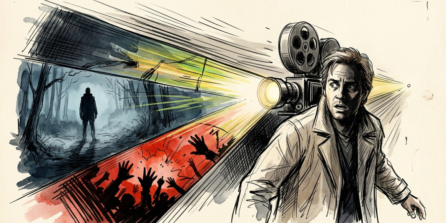

Watch a thriller and you will feel something before you understand why. Your pulse quickens. Your palms sweat. Something feels off, even when nothing frightening has happened yet. Filmmakers engineer that reaction deliberately, and color is one of their most powerful tools. Movie color psychology sits at the intersection of visual art and human neuroscience, shaping how audiences feel without a single word of dialogue. In this post, we break down exactly how thriller directors weaponize color, what specific hues trigger in the brain, and how you can watch these films with sharper, more informed eyes.
What Is Movie Color Psychology?
Movie color psychology refers to the deliberate use of color in cinematography and production design to influence a viewer’s emotional state. It draws from both established color theory and behavioral psychology. Directors, cinematographers, and production designers work together to ensure every frame carries an emotional charge.
In thrillers specifically, color becomes a language of unease. It signals danger before the plot does. Audiences absorb these cues instinctively, which is exactly the point.
")
")
")
Why Color Matters More in Thrillers Than in Any Other Genre
Thrillers live and die by tension. Unlike horror, which often leans on shock, thrillers build dread slowly and methodically. Color supports that slow build in ways that music and editing alone cannot achieve.
Moreover, color works on a subconscious level. A viewer might consciously notice a jump scare, but they rarely notice that an entire scene has been graded in cold, desaturated tones. Nonetheless, their nervous system responds. That invisibility is what makes color so effective as a manipulation tool.
The Emotional Language of Color in Film
Each color carries a set of psychological associations that filmmakers exploit with precision. These are not arbitrary choices. They connect to deeply ingrained human responses rooted in nature and culture.
- Blue and teal: coldness, isolation, clinical detachment, paranoia
- Red: danger, aggression, passion pushed to obsession, blood
- Yellow and sickly green: unease, nausea, moral corruption, decay
- Desaturated gray tones: bleakness, hopelessness, psychological entrapment
- High contrast black and white areas: moral ambiguity, hidden truths, duality
Understanding these associations transforms the viewing experience. Suddenly, a color choice feels like a whisper from the director directly to your nervous system.
How Cinematographers Use Color Grading to Control Mood
Color grading is the post-production process where colorists adjust the hues, contrast, and saturation of footage. In modern thrillers, this stage is where much of the psychological manipulation happens. It is precise, deliberate, and invisible to most viewers.
Many contemporary thrillers favor a teal and orange palette. Orange skin tones read as human warmth, while teal shadows feel alien and cold. That tension between warmth and cold keeps audiences in a state of low-level anxiety throughout a film.
Saturation as a Narrative Device
Saturation levels tell audiences how emotionally alive or dead a world feels. High saturation signals a heightened, almost hyper-real state. In contrast, draining color from a scene creates a kind of psychological flatness that audiences associate with danger or despair.
Some directors shift saturation across a film’s timeline. As a protagonist loses control or descends into paranoia, the world around them visually drains. Viewers feel that descent without needing an expository scene to explain it.
Iconic Examples of Color Psychology in Thriller Filmmaking
Studying specific films sharpens your understanding of how these techniques work in practice. Several celebrated thrillers use color as a core storytelling device:
- Se7en: David Fincher’s cinematographer Darius Khondji bathed the film in shadows, murky browns, and desaturated greens to create a world rotting from the inside.
- No Country for Old Men: The Coen Brothers used the harsh, sun-bleached palette of the American Southwest to communicate an inescapable, almost mythological dread.
- Black Swan: Darren Aronofsky contrasted sterile whites with creeping blacks and violets to map a character’s psychological collapse in real time.
- Parasite: Bong Joon-ho separated the wealthy Park household (bright, airy, green) from the dark, underground world of the Kim family with striking visual clarity.
- Prisoners: Roger Deakins kept the entire film in muted, wintry grays and blues, making every scene feel like a slow suffocation.
Each of these films treats color as a co-author of the story. Consequently, every frame carries meaning beyond what the characters say or do.
Red: The Most Weaponized Color in Thriller History
Red deserves its own focus because filmmakers deploy it with particular aggression in thrillers. It appears as a warning signal, a marker of violence, and a symbol of obsession. Directors often hold red back until a critical moment, then unleash it for maximum impact.
Furthermore, red activates a measurable physiological response in viewers: elevated heart rate and heightened alertness. Cinematographers know this. A single red object in a cool, desaturated frame pulls every eye in the room and signals that something is about to break.
Production Design and the Psychology of Space
Color psychology in film extends beyond the camera. Production designers select wall colors, furniture, lighting fixtures, and costumes to reinforce the emotional tone of every space a character inhabits.
Corrupt or threatening environments often feature sickly yellows and institutional greens. Safe spaces lean toward warmer, softer tones. As a result, audiences read a character’s safety level the moment they enter a new room, often before the script confirms it.
Costume Color as Character Psychology
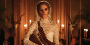
Costume design reinforces character psychology in ways viewers rarely notice consciously. In many thrillers, antagonists or morally ambiguous figures wear colors that subtly clash with their surroundings. Similarly, protagonists in danger often wear light or white tones, making them visually vulnerable against darker backgrounds.
- White costumes: innocence, vulnerability, exposure
- Dark or black clothing: concealment, threat, moral complexity
- Muted neutrals: invisibility, ordinariness used as camouflage
- Red clothing: a target, a warning, or dangerous intent
Practical Tips for Reading Color in Thrillers
Sharpening your eye for color theory in cinema makes every thriller richer. You stop being a passive viewer and start reading the film as a visual text. Here are some practical ways to engage with color more actively:
- Pause on wide shots and note the dominant hue of the scene before the action begins.
- Track how the color temperature shifts when a protagonist moves between safe and dangerous spaces.
- Notice when a single color appears in an otherwise monochromatic scene; that object almost always carries narrative weight.
- Watch the opening and closing frames of a film side by side; color shifts between them often summarize the entire emotional arc.
- Pay attention to costume colors during moments of high tension; they frequently contradict or reinforce the character’s stated emotions.
")
")
")
Watch Thrillers Like a Color Detective
Movie color psychology is one of the most rewarding lenses through which to watch thrillers. It reveals the invisible architecture behind your emotional reactions and deepens your appreciation for filmmaking as a craft. Directors do not just tell stories; they engineer how those stories feel inside your body.
Next time a thriller sets your nerves on edge before anything dramatic happens, look at the frame itself. Notice the temperature of the light, the saturation of the world, the hue of the walls. Interestingly, you will almost always find your answer written in color.


")
")